Visualizing Our Atmosphere
The map above provides a multi-layered view of atmospheric data from leading environmental satellites, including NASA's TEMPO and South Korea's GEMS. This powerful tool allows for the visualization of key pollutants like Nitrogen Dioxide (NO₂), Ozone (O₃), and Formaldehyde (HCHO).
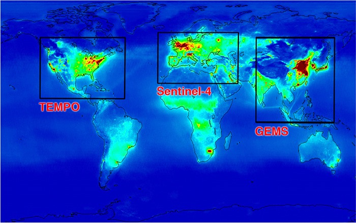
A constellation of geostationary satellites, including TEMPO (Americas), GEMS (Asia), and the upcoming Sentinel-4 (Europe), will provide comprehensive global air quality monitoring.
Data Sources Explained
- NASA TEMPO (Tropospheric Emissions: Monitoring of Pollution): A revolutionary instrument on a geostationary satellite providing hourly daylight observations of air pollutants over North America. Its high-resolution data helps scientists track pollution from its source to its impact on communities.
- GEMS (Geostationary Environment Monitoring Spectrometer): South Korea's instrument providing similar hourly air quality data over Asia. The GEMS layer on this map shows a forecast image generated from its recent observations.
How to Interpret the Data
The map layers use a color scale to represent the concentration of pollutants. Generally, warmer colors (yellow, orange, red) indicate higher concentrations, while cooler colors (blue, green) indicate lower concentrations. These concentrations are often measured in molecules per square centimeter (molec./cm²).
By switching between layers, you can compare the distribution of different pollutants and observe how they change over time, offering valuable insights into urban pollution, industrial emissions, and the long-range transport of air pollutants.